Mobile is the future. And farmers are adopting the technology faster than ever
Across the world ...

According to a Farm Journal Media survey, the majority of farmers already use smartphones and tablets. Nearly 90 percent of farmers will soon own a smartphone. In addition, 75 percent use smartphones for email.
Is your email readable on a smartphone?
If you create an email for farmers and review it in Outlook or on a desktop, you are missing a key review step. Check it across multiple devices using Litmus.com or a similar service that tests the format across various platforms. Does it appear the way you had intended? A majority of the recipients will probably view it on an iPhone, iPad or an Android device. According to Litmus Labs, users view 45 percent of email on an Apple mobile device. Here are the top 10 email clients:
1. Apple iPhone 31%
2. Gmail 22%
3. Apple iPad 11%
4. Apple Mail 7%
5. Outlook 6%
6. Samsung Email App 5%
7. Outlook.com 5%
8. Google Android 4%
9. Yahoo! Mail 3%
10. Windows Live Mail 1%
Marketing to farmers with responsive email
Responsive web design is a technique where a web page “responds” to the device viewing it. For smart phone users, the web page will present larger text, smaller images, change the menu, and other techniques to make it more readable and usable.
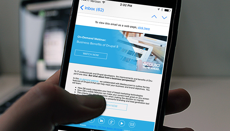
Your email should be responsive. It should present well on both desktops and mobile devices. Below are some examples the demonstrate the value of responsive emails.
The first email comes from a technical company with a responsive website. The message is readable on a desktop in Outlook, but not so much on an iPhone:

The next email looks good on a desktop and on an iPhone:

This is an example of responsive email design.
Those who have been doing email marketing for a while are familiar with the concept of “above the fold.” Email designers tried to keep key messaging at the top of the email, so it would appear in a preview pane on Outlook.
Mobile users are used to scrolling – it’s the way they view almost everything on their devices. While it’s still best practice to keep key messaging close to the top of the message, users will scroll down if they are interested. The “fold” doesn’t exist on smart phones.
Always remember, the destination for any link on your email should go to a responsive web page. Email clicks won’t bring you much business if you take mobile users to a non-mobile experience.
Ensuring your email content, design and platform are mobile-friendly, along with any linked pages, will guarantee your customers have a good experience with your brand and communications.
Across the world ...
Just ten years ago, broadband internet access was a nice to have. It meant we could send emails and browse the internet without lag times. Today, it ...
© 2024 Rhea + Kaiser. All rights reserved.